Designing a Fitness App Empty State System With Off-the-Shelf Illustrations
Building a mobile app’s functional core takes everything out of you. Weeks pass by connecting APIs and optimizing local storage. Interface responsiveness becomes an obsession. Then beta testing begins on a fresh device.
Your user experience feels completely lifeless.
Dashboards just say “No workouts logged.” Heart rate screens show a blank gray box. Network errors display a stark “404.” Guiding new users requires an empty state system. Hiring a dedicated illustrator demands budget and time you don’t have. Can stock libraries actually build a complete UI without looking entirely generic?
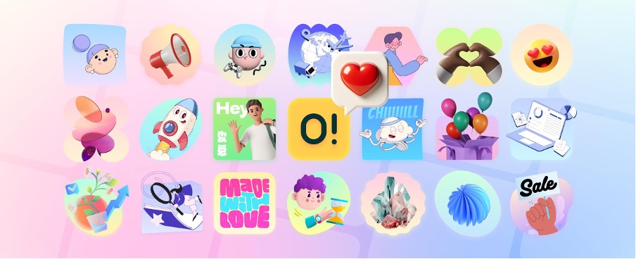
Ouch by Icons8 attempts solving that exact problem. They provide a massive library of vector, 3D, and animated illustrations. Integrating their assets into a native fitness tracking app took several weeks. My hands-on experience revealed some fascinating insights. Developers working without an in-house design team get distinct advantages alongside a few notable friction points.
Finding Visual Cohesion Under a Deadline
Picture a Thursday evening push. Beta release drops tomorrow. Devon, a solo developer, needs onboarding screens for a new cycling tracker. Users expect visual cues for “Enable Location Tracking” and “Connect Bluetooth Monitor.” Weekly mileage goals also require artwork.
Sketching crude icons won’t cut it. He opens Ouch instead.
Filtering the 101 available illustration styles takes seconds. Finding a modern, energetic look for a dark mode interface becomes the primary goal. Searching specifically through “Sport” and “Technology” categories yields 44 different 3D options.
Grabbing these visuals happens fast. Animated onboarding sequences download as MOV files. Static fallbacks export as high-resolution PNGs. Populating the introductory flow takes under two hours. Every asset originates from one exact style category. That cohesion eliminates the disjointed aesthetic typical of rushed launches.
Sourcing the Edge Cases
Locating an image of a person running takes zero effort. Finding graphics for a lost GPS connection error screen tells a different story. Basic asset libraries always fail here. Working through a project from start to finish requires handling highly specific interactions.
My workflow demanded complex error states. Searches for “sync failure” or “corrupted data” usually return terrible results. Ouch handles niche concepts beautifully because it avoids static, unchangeable scenes. Layered vector graphics get broken down into tagged, searchable objects.
Nature backgrounds sit isolated in the database. I grabbed one and paired it with a character checking a smartwatch. Adding a disconnected satellite icon completed the scene.
Generic clip art from a search engine simply can’t compete.
You assemble precise visual narratives using Ouch’s searchable components. Pichon makes it even better. Their desktop app lets you drag assets straight into your design canvas.
The Recolor and Export Workflow
Pre-made vectors usually ruin brand alignment. Apps relying on a neon green accent color look ridiculous next to pastel blue characters.
Adapting a “simple line graphics” style became my next challenge. Our fitness app needed aggressive neon green and charcoal hues. Mega Creator, a free online editor by Icons8, opened up the initial weightlifting illustration. Isolating individual vector paths proved incredibly straightforward. Changing primary hex codes globally took exactly three clicks.
Context matters just as much as color. Original artwork featured a character holding a clipboard. Component swapping fixed that instantly. Pulling a water bottle from the object database replaced the clipboard entirely.
Exporting as Lottie JSON finished the workflow. Lightweight loading animations keep users entertained while daily step counts sync with the server.
Boundaries of the Off-the-Shelf Model
Stock libraries can’t replace custom illustration everywhere. Highly specialized medical applications require exact anatomical accuracy. Technical aerospace dashboards need precise mechanical details. Available categories might lack those specific nuances.
Pricing models also dictate your implementation strategy.
Free PNG downloads exist on Ouch. They require a link back to Icons8, unfortunately. Placing attribution links on a native mobile app’s 404 screen ruins the native feel. Onboarding modals get cluttered fast.
Buying the Pro upgrade practically becomes mandatory for app development. Paid plans unlock editable SVG files and Lottie animations. Attribution requirements disappear entirely.
Trendy styles carry long-term risks too. Selecting one of the platform’s 15 popular aesthetics gives competitors an easy target. Rivals can download those exact same assets tomorrow. Empty states, blog articles, and secondary screens handle this reality perfectly. Primary company logos or merchandise print runs expose a harsh truth. You don’t own exclusive rights to the artwork.
Weighing Ouch Against the Field
Visual asset tools require evaluating the broader ecosystem. Here’s how Ouch compares against other common UI design approaches:
- unDraw: Developers love this staple for quick, free SVG downloads and built-in color picking. Aesthetic fatigue remains the biggest drawback. It features one single distinct style. Ouch offers significantly more variety. Over 101 styles range from minimal monochrome to wild surrealism.
- Humaaans: Mixing and matching body parts creates brilliantly diverse characters. Team pages shine using this tool. Non-human subjects reveal its true limitations. Ouch covers that exact gap with 23,000 technology illustrations. Business categories add another 28,000 assets. Server racks and fitness equipment get equal representation.
- Custom Illustration: Commissioning a professional illustrator yields perfect brand alignment. Exclusive rights come standard. Such projects also cost thousands of dollars and take weeks of revision cycles. Blank screens need immediate solutions. Ouch validates your product today so you can afford a custom rebrand tomorrow.
Tactics for Working With Pre-Made Vectors
Maximizing a stock illustration library requires ruthless asset management. Keep these tactics in mind before downloading anything:
- Select a single style name immediately. Use it exclusively across your entire application to maintain visual continuity and build trust.
- Prioritize Lottie JSON and Rive formats during mobile development. Application bundle sizes stay small. Animations remain incredibly crisp.
- Store a master file of modified SVGs inside your main design software. Editing them repeatedly in the browser tool wastes precious hours before launch.
- Download all necessary empty state visuals at exactly the same time. Capturing every required interaction ensures you don’t lose access before a creator updates their style or pulls a specific graphic.