10 Popular Logos Carrying A Secret Meaning
The process of creating a company’s well-known logo can be a delicate challenge with highly positive results, which sets and positions one brand apart from the other. Customized logos are essential for gaining:
- Public recognition
- Establishing a corporate identity
- A way to build a reputable brand that attracts loyal and long-lasting customers
While some common logos are instantly recognizable, there are subtle details in most famous logos that might require a little more observation to understand the entire design while gaining insight into the whole picture.
While some popular brands promote their logos with what you have come to believe as one universal meaning, there are actually a number of double meanings developed into numerous brand strategies that are executed through their unique trademarks. Here are 10 famous logos that may require a second look to uncover their hidden meanings.
In 1908, the decadent milk chocolate bar, famously known as Toblerone, was created by Theodor Tobler in Bern, Switzerland.
Known for its unique nougat, almond, and honey taste, carefully molded into long, triangular bites, Tobler wanted to pay tribute to the chocolate bars’ place of origin when he decided to create a logo distinguishable to the brand.
Upon first glance, the iconic logo looks fairly simplistic in identifying the name of the brand with an image of a high mountain above it. However, the mountain is symbolic of the Matterhorn mountain, a mountain of the Alps located between Switzerland and Italy, where the chocolate was originally created.
But it doesn’t stop there. If you look closely at the Matterhorn mountain, built into the negative space, there is an image of a smiling bear which uniquely reflects Bern as a city that is famously associated with bears.
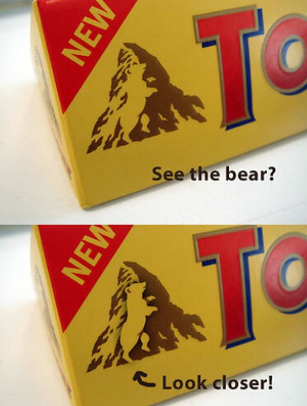
Image Source: Kyle Jones
Although you may use Pinterest as one of your daily photo-sharing platforms, you may have failed to notice its unique logo that embodies its main service as a pinboard.
While the letter ‘P’ might seem like an obvious reference to its name, the image was designed to double as a pin.
What better way to introduce a virtual pinboard with a logo that subconsciously directs you to pin and organize your interests?
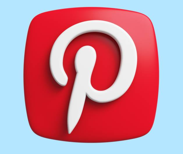
Launched in 2010, accompanied by its fitting logo, the platform was featured in Time magazine’s ‘50 Best Websites’ only a year later and has continued to grow substantially since then.
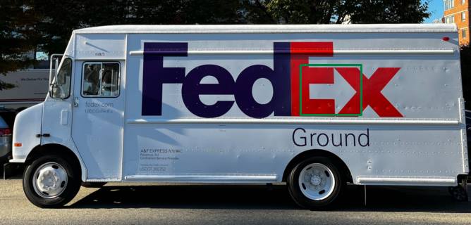
The multinational delivery service FedEx, which previously went under the name Federal Express, is known for its white delivery trucks printed with their purple and orange logo.
However, the clever take on their logo that alludes to their courier services might not be as easily detectable as the big and bold print.
This FedEx trademark contains a subliminal arrow in the negative space between the ‘E’ and the ‘X’ to gesture their always-on-the-move delivery services.
Founded in 1971, this corporation has become a reputable service that continues to expand its services worldwide. Formerly known as the South Korean brand called ‘Lucky-Goldstar,’ LG corporation has established a recognizable logo affiliated with their wide variety of products, including electronics, chemicals, and plastic.
According to a website called ‘Famous Logos,’ the shape and design of the LG logo contain elements of a human face in an effort to symbolize the company’s main objective of making their customers happy.
Where the ‘L’ is utilized as a nose that is wrapped around the ‘G’ to resemble the structure of a face, the colored circle wrapped around the entire emblem symbolizes a globe of smiling faces.
While it might appear as a winking face, the one eye carries a significant meaning in delivering a message of focus and is meant to be goal-oriented.